At Place Creative, I spent the majority of my time working with Darn Tough Vermont. As a designer, they are a really exciting company to work with because the range of work is astounding. The core branding is ultra utilitarian, but then they’re never afraid to get weird and throw something completely off the wall out there for a campaign. I found it equally gratifying to work as part of a larger team to develop highly functional, Swiss-inspired packaging as I did having the freedom to get weird with humor and illustration in social media content, stickers, and tees.
Let’s Grow Kids is an organization working to strengthen early childhood education throughout Vermont. This children’s activity book is handed out at Burlington International Airport and LGK sponsored events, to be used as an educational tool for both parents and children. Project scope included layout, illustration, and design of the paper airplane activity.
Vermont Coffee Company has been selling their Viva Cafe line of Dominican sourced coffees for some time now in their iconic kraft paper bags, but as they expand distribution they decided it was time to let Viva Cafe live as its own brand on store shelves. I was tasked with creating new packaging that amplified the Viva Cafe brand, with its bold colors and authentic wood cut artwork. I followed this project from initial concepting, through production, and finally to product photography.
River Garden is a Vermont-based salad dressing maker with a storied past. The company recently came under new ownership, and came to Place looking to rebrand, but maintain their Northeast Kingdom heritage. This design option was intended to inject a little fun into the brand by playing off of garden gnomes. The client loved the idea, but ultimately went with a more conservative approach.
The Champlain Mini Maker Faire is self described as “a gathering of fascinating, curious people who enjoy learning and who love sharing what they can do. From engineers to artists to scientists to crafters, Maker Faire is a venue for these "makers" to show hobbies, experiments, projects.” I used icons and illustrations in an effort to visualize and communicate that sentiment. Just about any person can go to the Maker Faire and find something that interests them.
HortLabs is an AgTech start up that is creating a cohesive system for the monitoring, management, and analytics of greenhouses and indoor growing spaces. At HortLabs, I have been responsible for branding and UX development. The images here are but a preview of what is to come.
Maple Plus is a local business manufacturing CBD infused Vermont maple sugar. Maple Plus initially entered the market selling bulk quantities in specialty shops. They quickly saw a need to offer their product in a more accessible and affordable format to introduce new customers to the benefits of CBD and great taste of Vermont maple sugar. These stick packs were designed to be offered at point of purchase in coffee shops across the country.
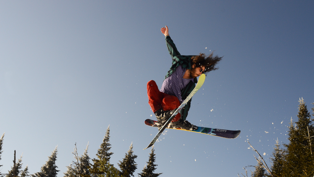
This is the first in a series of posters promoting the Cochran's Enduro Series coming this summer. Cochran's Ski Area has a great old school vibe, so I looked to vintage motocross and racing posters for inspiration. I kept the same color palette as Cochran's to keep brand consistency. Future dates of the poster will include new imagery and some color variations within the palette.
Earl's Cyclery & Fitness recently came under new ownership, and I was asked to give the brand a refresh and bring it into the 21st century. Earl's is well established in the Burlington area, having been in business for over 50 years, so we decided steer away from cycling motifs and let the unique lettering from the last rebrand shine through. The real task was to create a consistent look and feel, both in store and in advertising. Franklin Gothic was chosen as the primary typeface because of its blue collar sensibility. We've carried this branding all the way through, from website and digital ads to in-store signage and print ads.
The new Earl's website can be viewed here.
At Storrs Center Cycle, I was tasked initially with refreshing the logo. I began with rebuilding the old .jpeg logo with vectors so it could be scaled as needed. At this stage, the logo was also placed into the circle, which gave it more power to stand on it's own. The typeface Avenir had been chosen as it is clean and concise, and carries itself well as a headline or in copy. The C's in the logo were then recreated to match proportions and styling of Avenir. With the new logo and branding in place, I set out to build a website where we could show the typical prices, hours, location, etc., as well as showcase the custom bike and wheel builds that SCC is known for. The information presented in the website needed to be clear and easily found. In addition to laying out and building the website, I was in charge of taking new photographs and curating existing photographs for the website. In addition to the website, I created jerseys, kits, and tees for the shop. The road race kits were inspired by vintage race cars from the 60's, while the mountain kits are a strong contrast with their 80's metal inspiration. I also designed tees that were heavily inspired by Fat Chance and Fat City Cycles jerseys from the early 90's.
Malaika is an independent yoga instructor based in the Burlington, VT area. She came to me to help create a personal brand and launch a series of yoga nidra CDs. Together we developed a logo that is simple and recognizable, and subtly says "om".
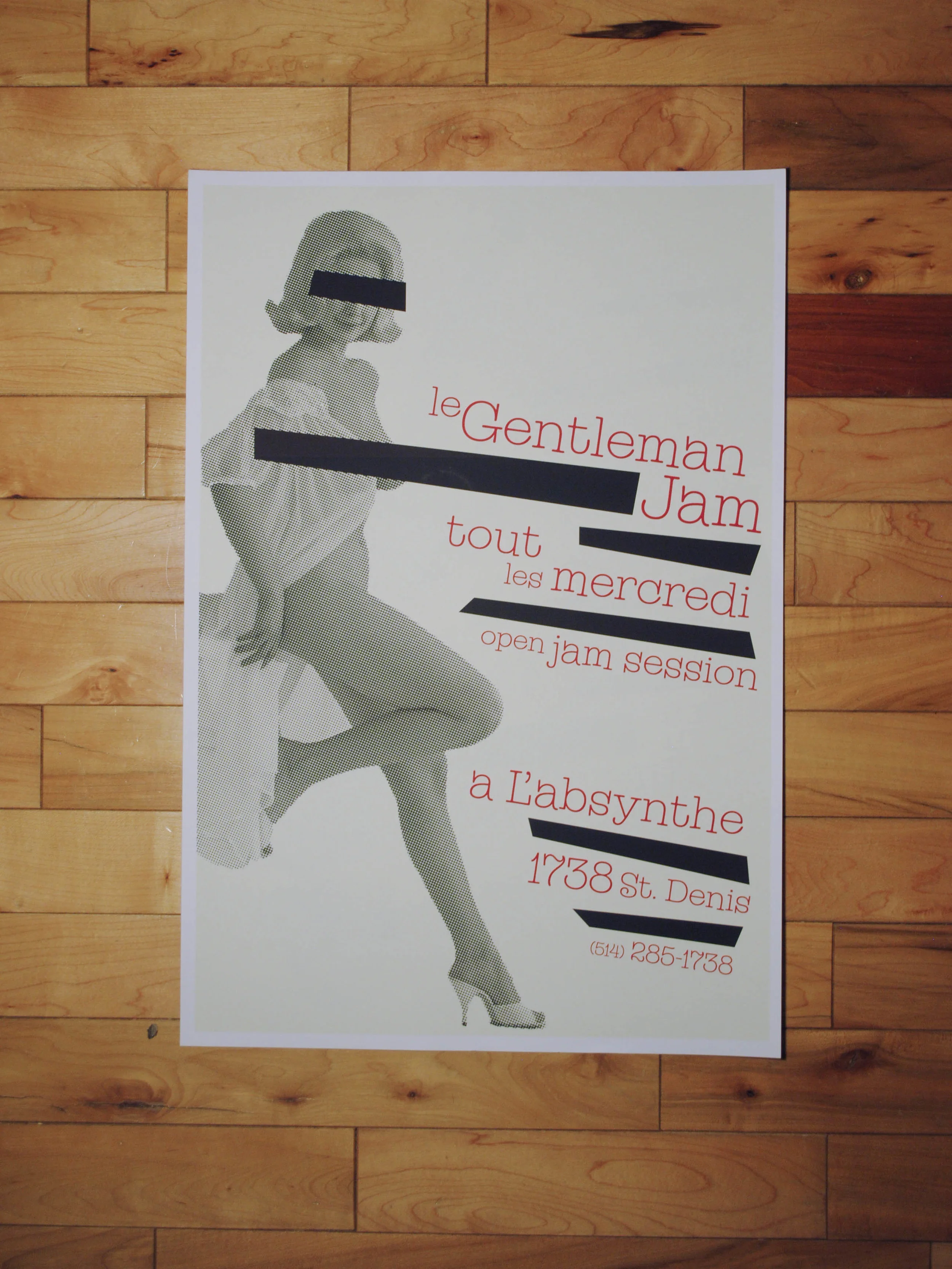
Le Gentleman Jam is a jam band that performs every Wednesday night at L'Absynthe in Montreal. The strip club across the street was the inspiration for their name, so I thought it was only proper that it would be the inspiration for their poster as well.
Locked Groove Media was an idea for a publishing firm brought to me by a friend. I liked the idea so much though, that I decided to continue with the branding and create a poster series for it. The idea of the “print & film & music.” on repeat stems from the locked groove of a record repeating itself when a side has finished playing. I felt that Locked Groove could make the biggest impact if it evoked a sense of nostalgia and reminded people that print, film, and music are indeed alive and well.
Ricochet is a fictional skate company that I originally created for a college design class. I’ve noticed a trend over the past few years of core brands in the skate industry going towards a more boutique, high fashion style. With Ricochet, I felt it was important to hit the boutique style, but also maintain the gritty reality of skating. To do so, I emphasized white space and used a light weight logomark and type. The grittiness comes from high grain, contrasty film photography.